Hi-Chew
Around a year ago, I changed from a casual candy consumer to a sugar fiend all thanks to the day I was introduced to Hi-Chews. These delicious fruit chews from Japan are a little bit like Starbursts, but 100x better–due to their flavor, texture, chewability, and more–and while my dentist may not be too happy with me, I’m grateful they came into my life.
Since I spend so much time with this candy, I figured I’d take a stab at modernizing its packaging, all the while maintaining its fun look and feel.

Where we were.
With bright and saturated colors, the old Hi-Chew packaging definitely draws the eye in the candy aisle, but there’s a lot of information to read all at once. In my new designs, I wanted to try a simplified approach that maintained the fun spirit while focusing on the chews themselves.
Where we are.
If you want to get a closer look, click on the images!
The Original pack was my first introduction to the Hi-Chew brand, so that’s where I decided to start my redesign.

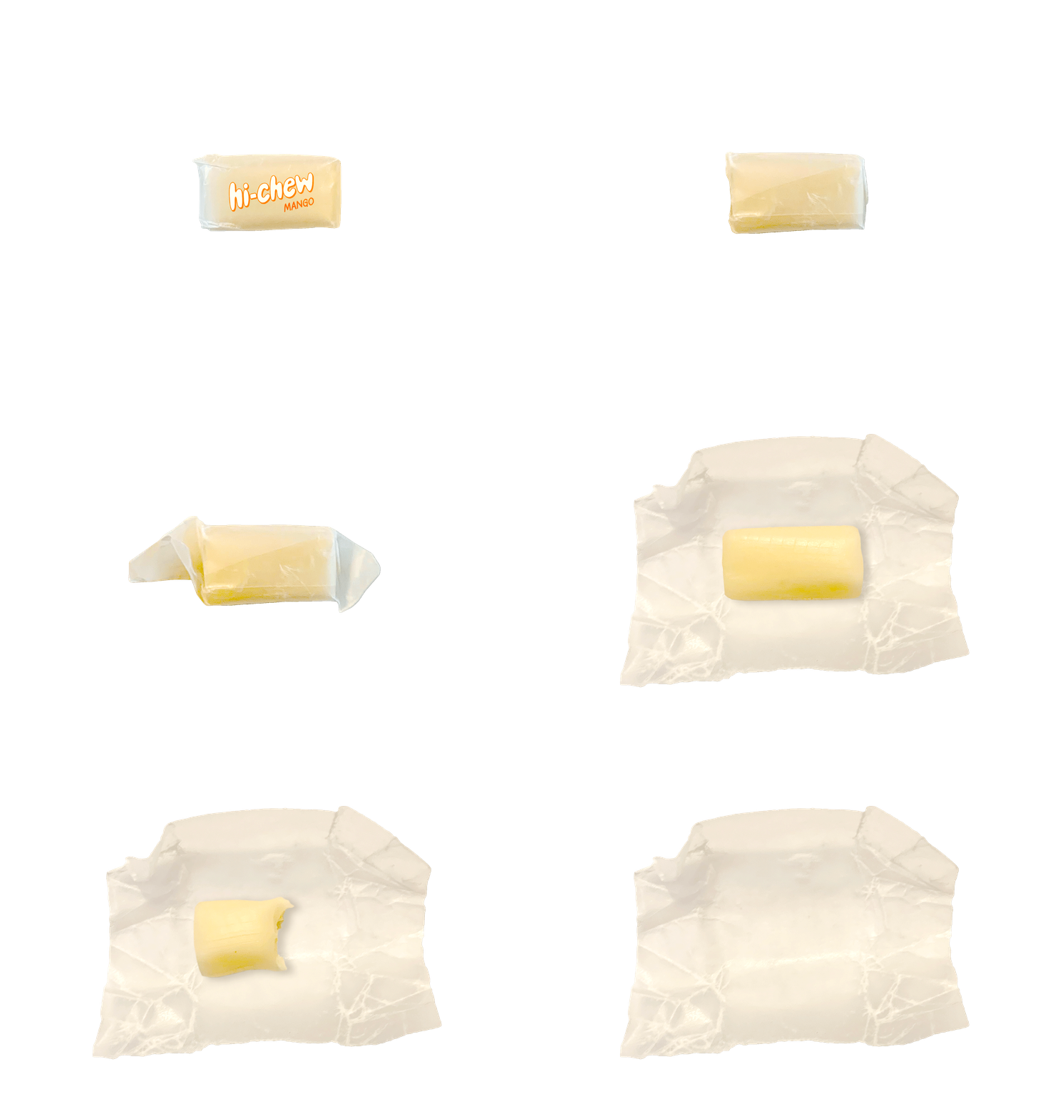
The (Un)Wrap
For some reason, Hi-Chew’s current wrapping and I don’t get along, leading me to struggle when opening every chew. With this easy-to-open wrapper, Hi-Chew fans will be able to enjoy without interruption. The wrapping also takes up less space, so the brand will be able to fit more chews into one package.
My favorite pack is the Tropical triad. With a mix of Kiwi, Pineapple, and Mango, I can pretend I’m eating summertime fruits even in the winter.


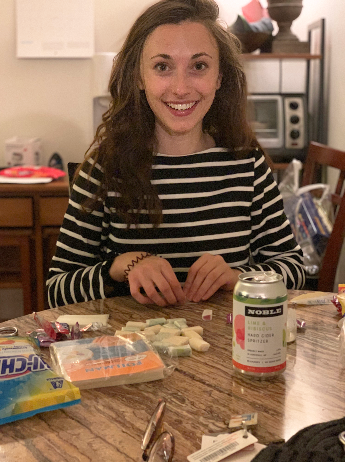
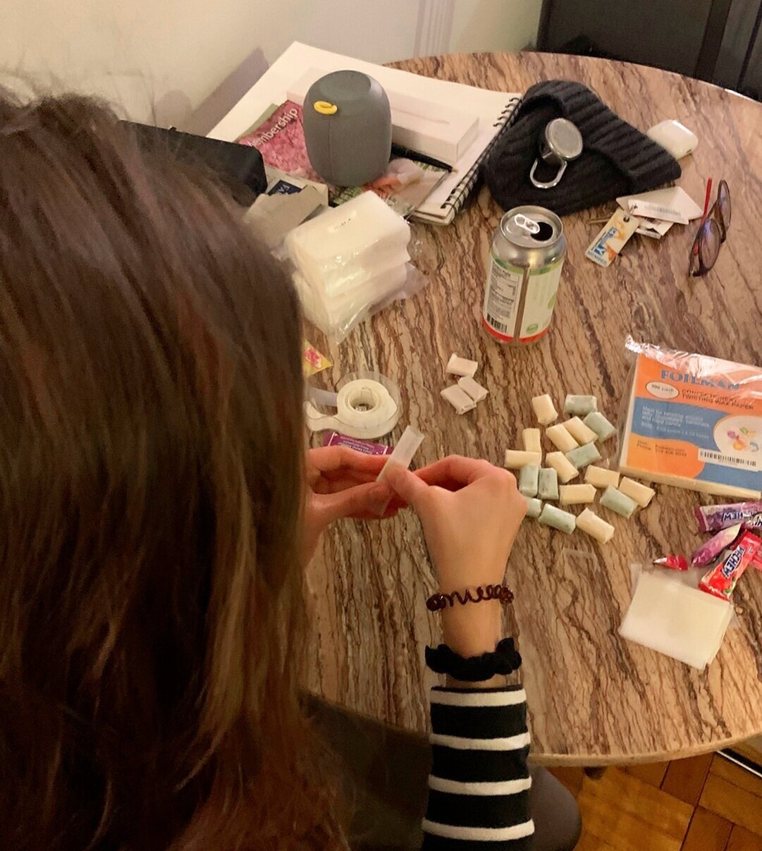
The Process.
Many Hi-Chews were eaten in the making of this project.
The cat was not harmed.


